Your site speaks volumes for who you are, and what you do
Objective
Create a landing page to speak to my client's brand and increase their conversion rates
Project Length
2 Weeks
Role
Visual Designer
Tools used
Sketch, codepen(HTML/CSS), Visual Design, Front-End Development
Problem
Client's website is clean and simple. It doesn’t speak to their brand, and lacks any user engagement.
Solution
Design a website which speaks to client's potential brand and provides a memorable experience for users.
Deliverables
Complete Landing Page Mockup
Landing Page Coded in HTML/CSS
Paper Sketches
Turning the sections of the landing page into html tags helps visualize the website in code.
Iterations
1st Sketch Mockup
3rd Iteration
2nd Iteration
4th Iteration
Process
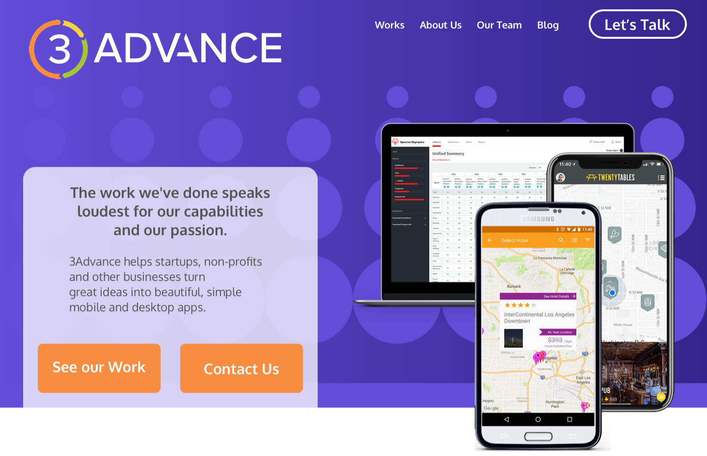
I repurposed a lot of what already existed on 3Advances site, since I did think the content itself was very effective. By reorganizing the content, I wanted to create a narrative for 3Advance as a whole, allowing their content to convey a narrative that speaks to their brand, their mission statement, and their history.
Examples of client work first and foremost, next to a small quote describing the kind of work that 3Advance does.
Branding & Theming
You will also notice the large number of circles placed around my design. This is to create a theme which reflects their logo, and speaks to their brand:
Collaboration, team work, and professionalism, but without being corporate.
Color Palette
Because of the prominent orange within 3Advance’s logo, I decided to use a dark purple gradient as the background. Purple is a triadic color of orange’s and when paired, the two pop without being too striking.
"Give the user something to be interested in and get enough information while also providing them outlets to get more info if they so desired."
Website Sections
I repurposed the 3Advance logo colors and created a bubble logo to further compliment the theming and create something striking for the user in areas where the content may be more word heavy.
3Advance has a wonderful pull quote explaining the name of their company. I found this to be imperative in explaining the values of the company and displayed it prominently.
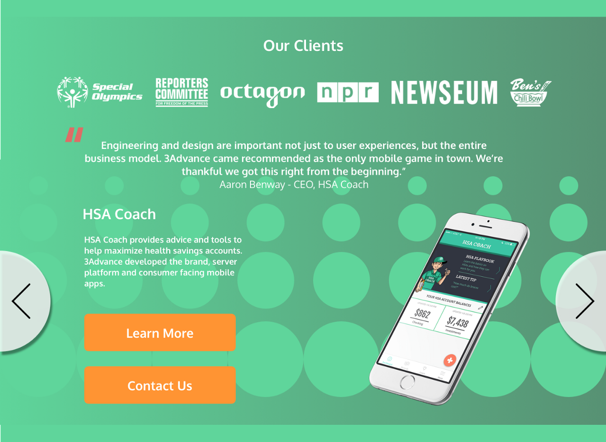
The clients section combines the quotes on their current landing page and gives them context, by displaying the quotes, their clients, and the work they did for those clients into one package. This section would be a carousel which changed colors based on which client work you were viewing, very similarly to what already existed on their site.
This design also received some feedback that the white text wasn’t easily read on the darker background, so I flipped the gradient.
Discovering a way to effectively modify their team section so it could be attention grabbing and tell a story. that is until I really focused on their logo as a brand. 3Advance had already encircled their team members within green circles, so i decided to take that further, and display the team as parts of 3Advance as a whole. This worked very well when paired with the quote they had already paired with the team. I found this section to be very effective and when presenting the project to the client, they had felt so as well.
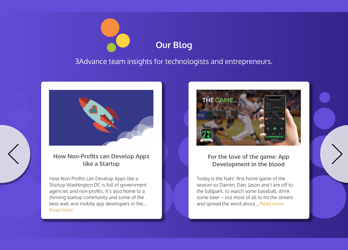
I made 3Advances blog section (a component necessary to keep up SEO) more modular, changing it into a carousel with cards so blog articles could be added within ease and contain the same amount of space.
Lastly, I wanted the parting words of 3Advance’s site to be their core values, also taken directly from their site. These speak loudly to what matters to them and how they may provide those values to their prospective clients, ending with a large CTA.


